
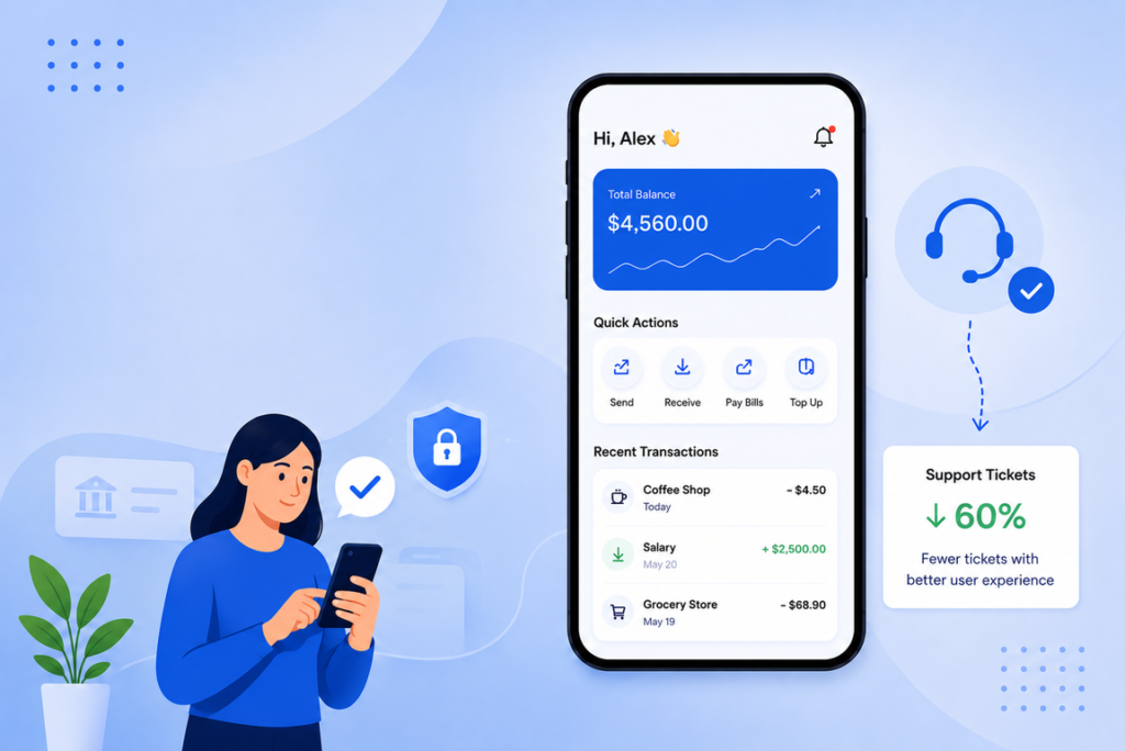
Every fintech founder we’ve worked with at Speqto eventually asks the same question: “Why is our support team drowning in tickets?” The honest answer, nine times out of ten, isn’t a training problem or a staffing problem. It’s a UX problem wearing a customer support costume.
We recently audited the support logs for an NBFC client running a personal loan app with close to 40,000 monthly active users. Their support team was handling over 2,000 tickets a month, and nearly 60% of them fell into just three buckets: “Where is my loan status?”, “Why was my EMI deducted twice?”, and “How do I download my repayment schedule?” None of these were bugs. They were design gaps.
Support Tickets Are a Symptom, Not the Problem
In BFSI products, users are dealing with money, deadlines, and often anxiety. If the app doesn’t answer their question in the moment, they don’t wait — they open a ticket, call the helpline, or worse, leave a 1-star review that says “app is confusing.” Every one of those tickets costs you agent time, CSAT score, and trust.
The fix isn’t a better FAQ page buried three menus deep. It’s designing the interface so the question never needs to be asked.
Where Fintech UX Usually Breaks Down
- Status ambiguity: A loan app that just says “Processing” for four days will generate calls. Users don’t need faster processing as much as they need visibility into what stage they’re at.
- Silent failures: Payment gateways timing out without a clear message (“Did my money go through or not?”) is one of the single biggest ticket generators in UPI and wallet apps.
- Jargon-heavy microcopy: Terms like “float balance,” “T+2 settlement,” or “lien amount” mean nothing to a first-time investor. Every unclear term is a potential support call.
- Buried critical actions: If “download statement” or “raise a dispute” is three taps deep in a hamburger menu, users will call instead of hunting for it.
What Actually Moved the Needle for Our Clients
1. Real-time status tracking with plain language
For the NBFC client mentioned earlier, we replaced the generic “Processing” label with a five-step visual tracker: Application Received → Document Verification → Credit Check → Approval → Disbursal. Each step showed an estimated time window. Within six weeks of release, “where is my loan” tickets dropped by 71%. Users weren’t impatient about the wait — they were anxious about the unknown.
2. Transaction confirmation states that don’t leave room for doubt
A wallet client of ours had a recurring issue where users would get a “Payment Failed” screen even when the money had actually deducted and would settle in a few minutes on the backend. We redesigned this into three explicit states — Success, Failed, and Under Verification (with a clear timestamp and “we’ll notify you within X minutes”) — instead of forcing a binary success/fail message. Duplicate payment complaints fell by more than half in the following quarter.
3. In-context help instead of a separate help section
Rather than routing users to a generic help center, we started embedding contextual tooltips directly next to confusing fields — right where the confusion happens. On a wealth management app we worked on, adding a simple “What is XIRR?” info icon next to portfolio returns cut related tickets by nearly 40%. Users don’t want to search for help; they want the answer where they already are.
4. Self-service actions surfaced, not hidden
We moved “Download Statement,” “Report an Issue,” and “Update KYC” from a settings submenu to the home screen dashboard for a credit card management client. These three actions alone accounted for close to a quarter of their monthly tickets before the change. Making them one tap away from the home screen reduced related tickets by roughly 30% within two months.
The Business Case, Not Just the UX Case
For BFSI decision-makers, this isn’t just a design nicety — it’s a cost and compliance conversation. Every support ticket has a real cost per resolution, and in regulated environments, every unresolved query around money movement carries reputational and compliance risk. When we’ve mapped ticket categories against screen flows for clients, the pattern repeats: 50-70% of ticket volume traces back to a small number of fixable friction points, not to product complexity itself.
The teams that get this right treat support ticket data as a UX research input, not just an operations metric. Reviewing your top 10 ticket categories every quarter against your actual app flows will tell you more about your UX gaps than any usability test.
Where to Start
- Pull your last 90 days of support tickets and tag them by app screen, not just issue type.
- Identify the top 5 recurring categories — these are your redesign priorities, not your entire backlog.
- Prototype fixes for status visibility and transaction states first; these consistently deliver the fastest ticket reduction.
- Re-measure ticket volume 6-8 weeks after release to validate impact before moving to the next batch.
At Speqto, this is usually where our fintech engagements start — not with a full redesign, but with a ticket-to-screen audit that tells us exactly where users are getting stuck. It’s cheaper than hiring more support agents, and it fixes the actual problem instead of managing its symptoms.