
Loading...

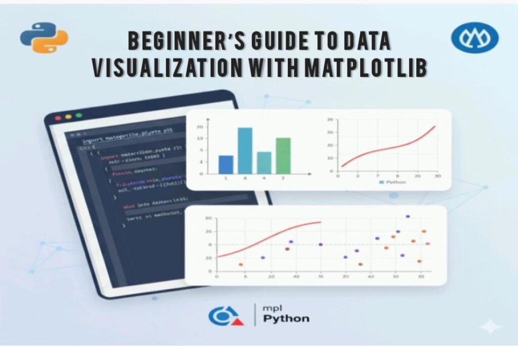
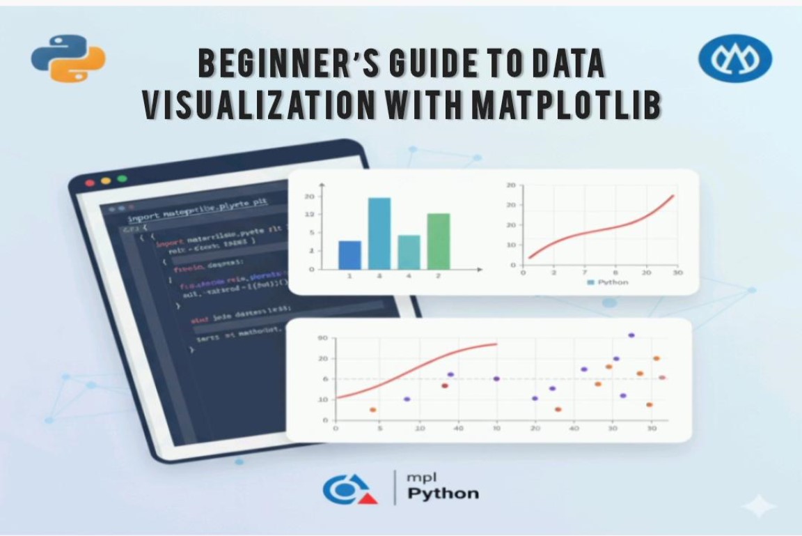
Beginner’s Guide to Data Visualization with Matplotlib

Beginner’s Guide to Data Visualization with Matplotlib

By Sumit Pandey

27 Oct, 2025

matplotlib pie chart

Introduction

Data visualization plays an important role in presenting information in a clear and meaningful way.
Pie charts are commonly used to display data as percentages of a whole, making it easier to understand
how different categories compare. In Python, the Matplotlib library enables us to quickly create
visually appealing pie charts with various customization options. In this beginner-friendly guide,
you will learn how to create and customize pie charts step-by-step.

What You Will Learn

  • How to install Matplotlib
  • How to prepare data for pie charts
  • How to create and customize pie charts
  • How to add labels, percentages, and legends

Prerequisites

  • Basic understanding of Python
  • Python 3 installed on your machine
  • Matplotlib library installed

Step 1 — Create a Project Folder

First, create a folder where your code will be stored:

mkdir pie-chart
cd pie-chart

Step 2 — Install Matplotlib

Run the following command in your terminal to install Matplotlib:

pip install matplotlib

Step 3 — Write the Code

Create a file named pie_chart.py and add the following code:

import matplotlib.pyplot as plt

# Data to be plotted
languages = ['Python', 'JavaScript', 'Java', 'C++']
popularity = [40, 25, 20, 15]

# Plotting pie chart
plt.pie(popularity, labels=languages, autopct='%1.1f%%', startangle=90, shadow=True)

# Adding title
plt.title('Programming Language Popularity')

# Display the chart
plt.show()

Step-by-Step Code Explanation

  1. Import Matplotlib: We import Matplotlib’s pyplot module to create charts.
  2. Define data: We create two lists — one for languages and one for their popularity.
  3. plt.pie(): This function draws the pie chart.
  4. autopct: Displays percentage values on each slice.
  5. startangle: Rotates the chart for better orientation.
  6. shadow: Adds a subtle 3D effect.
  7. plt.title: Adds a title above the chart.
  8. plt.show: Displays the chart window.

Step 4 — Run the Script

Execute the script using the following command:

python pie_chart.py

A new window will open, displaying your pie chart.

Customizing Your Pie Chart

Matplotlib allows extensive customization. For example:

  • Custom colors to match your theme
  • Explode to highlight a particular slice
  • Legend to add additional context
colors = ['#ff9999','#66b3ff','#99ff99','#ffcc99']
explode = (0.1, 0, 0, 0)

plt.pie(popularity, labels=languages, colors=colors, explode=explode, autopct='%1.1f%%')
plt.legend()
plt.show()

Real-World Use Cases

Pie charts are useful in various scenarios, such as:

  • Market share analysis
  • Customer segmentation
  • Survey result visualization
  • Budget allocation
  • Election result distribution

Common Errors & Fixes

  • ModuleNotFoundError: Ensure Matplotlib is installed correctly.
  • Empty chart: Make sure your data lists contain values.
  • Wrong pip version: On Linux/Mac, try pip3 install matplotlib.

Conclusion

Pie charts are a simple yet effective way to visualize category-based data. With Matplotlib,
creating and customizing them becomes easy even for beginners. You can now use these skills
to present survey insights, business reports, analytics, and more in a visually appealing manner.

RECENT POSTS

Why Long-Term IT Partnerships Outperform One-Off Project Vendors

A few months back, a CTO at a mid-sized NBFC told us something that stuck: “Every time we onboard a new vendor, we’re paying for the same discovery phase all over again.” His team had worked with four different development shops in three years, each one solving a narrow problem and then disappearing. The core […]

Choosing a Tech Partner Who Actually Understands Regulatory Compliance

A few months back, a fintech client came to us after a failed product launch. Their previous development partner had built a solid lending app — clean UI, fast performance, good UX. The problem? Nobody on that team had accounted for RBI’s Digital Lending Guidelines around data storage and third-party data sharing. The app went […]

How Automation Reduces Manual Errors in Banking Back-Office Work

A few months ago, we sat down with the operations head of a mid-sized NBFC who told us something that stuck with us: “My team isn’t lazy or careless. They’re just human, and humans reconciling 40,000 transactions a day will always slip somewhere.” That one sentence sums up why banking back offices keep bleeding money […]

Building Dashboards for Real-Time Transaction Monitoring: What Actually Works in BFSI

A few months back, one of our fintech clients — a Mumbai-based NBFC processing close to 40,000 UPI and card transactions a day — came to us with a problem that sounded simple on the surface: “Our fraud team is looking at data that’s 15 minutes old, and by the time they act, the money’s […]

Why a Dedicated PM Matters in Outsourced Software Projects (Especially for BFSI Teams)

A few months ago, a fintech client came to us at Speqto Technologies after a rough experience with a previous outsourcing vendor. The code wasn’t the problem — their developers were competent. The problem was that nobody owned the project end to end. Requirements got lost in Slack threads, QA found bugs three sprints too […]

POPULAR TAG

POPULAR CATEGORIES